Enhanced KPI reports that lead to the most appropriate behaviors are available through the Integrated Enterprise Excellence (IEE) business management system and its 30,000-foot-level performance metric reporting, which can provide a prediction statement.
Key Performance Indicators KPI reports need to be formulated so that the most beneficial behaviors occur; however, this does not often occur with current presentation practices.
Key Performance Indicators KPI reports scorecard are to help manage an organization’s performance through the optimization and alignment of organizational units, business processes, and individuals. A scorecard can also provide goals and targets, is to help individuals understand their organizational contribution. Scorecards might span the operational, tactical, and strategic business aspects and decisions of any business. A dashboard displays information so that an enterprise can be run effectively. A dashboard is to organize and presents information in a format that is easy to read and interpret.
Issues with Key Performance Indicators KPI Reports
Content of this webpage is from Chapter 3 of Integrated Enterprise Excellence Volume III – Improvement Project Execution: A Management and Black Belt Guide for Going Beyond Lean Six Sigma and the Balanced Scorecard.
The above stated objectives are good; however, traditional scorecard practices using techniques such as stoplight scorecards, table of numbers, stacked bar charts, and pie charts have issues with achieving the stated desires.
A performance metric is a performance-related measurement of activity or resource utilization. Year-to-date metric statements are one form of performance metric reporting, while other formats involve tables or charts. Performance-measure report-out formats can have a dramatic influence on behaviors. Many situations can have numerous report-out options. Much unproductive work can be generated if the best scorecard/dashboard metric is not chosen.
Examples of Key Performance Indicators KPI Reports Issues
This paper describes frequently used performance metrics and scorecard/dashboard reporting formats for Key Performance Indicators (KPIs) and other organizational measurements, which can create unhealthy, if not destructive, organizational behavior.
To address these issues, an alternative 30,000-foot-level performance metric reporting methodology is suggested as part of an Integrated Enterprise Excellence (IEE) business management system. IEE provides an orchestration methodology that allows organizational enterprise management systems to react more quickly to favorable or unfavorable circumstances, while at the same time providing a system for the enhancement of improvement project identification and execution so that the enterprise as a whole benefits in the long term.
Table 1 exemplifies one commonly-used performance measure report-out. This report format has calendar boundaries that reflect only quarterly and annual results. This type of chart does not present response data as though it were a result of internal processes that inherently have variability. In addition, this chart cannot identify trends, detect unusual events in a timely fashion, or provide a prediction statement.
Is there a consistent message presented in Table 1? Invariably you will get stories that cannot be verified in the table. To illustrate this point, look at the third line. For a presentation description about this line, you might hear something like “We staffed up in 2002 to prepare for annexations, but they did not happen as quickly as expected. This drove our cost per call up. As we annexed in 2003, you can see it coming down. We are on track.”
It may be a true story, but is it the whole cause as it is represented? It is a good bet that the presenter will describe many of the ups and downs in the table in a story format, where in reality much of this motion is the result of common-cause variability. Have you seen tables like this before presented with a similar dialog?

Table 1: Traditional Performance Measures: Tabular Reporting.
This form of performance reporting and other year-to-date metric statements typically lead to stories. This means that someone presenting this scorecard/dashboard will typically give an explanation for the up-and-down movements of the previous quarter or year. This is not dissimilar to a nightly stock market report of the previous day’s activity, where the television or radio reporter gives a specific reason for even small market movements. This form of reporting provides little, if any, value when it comes to making business decisions.
Whether in a business performance measure or a stock market report, these reported causal events may or may not have affected the output. The individual measurement value may cause an alarm that triggers some corrective action, or the numbers may be viewed only as a simple report. In either case, most measurement variability is typically the result of the system’s common-cause variations.
An alternative to table presentations for a data-driven company is chart presentations. For example, user guidelines from QuickBase 2006 state: “What information do you want to show? This is always the first question you must ask yourself when creating a chart. For example, if you want to show what percentage each salesperson contributes to the bottom line, try a pie chart, which is great for showing how parts relate to a whole. Or maybe you’d prefer to show how each salesperson has been doing over the course of the year. In that case, a line chart might work best. That way you could plot each person’s sales numbers through time and see who is improving.”
This frequently followed charting advice can head to playing games with the numbers, which can result in unhealthy behaviors. This type of charting advice could lead to one or more of the report-outs shown in Figures 1 – 3.

Figure 1: Salesperson monthly revenue for the last 12 months – Presented as a pie chart and line chart.

Figure 2: Salesperson monthly revenue for last 12 months presented as a stacked bar chart.
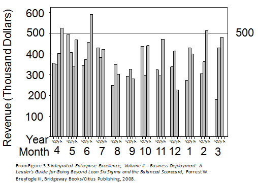
Figure 3: Year-to-year monthly revenue chart tracking against a mean monthly goal of $500,000.
Years are designated as 0, 1, 2, and 3; for example, 0 = 2000 and 1 = 2001. The figure indicates that the data were compiled at the end of March, since there are four bars for months of: 1 = Jan., 2 =Feb., and 3 = Mar.
Similar to summarizing data through a table, the chart report formats in Figures 1 to 3 typically lead to stories about the past. The chart presentation format will dictate the presented story type. For example, the calendar boundaries in the bar-chart reporting format in Figure 3 will surely lead to adjacent-month and previous year-month comparisons. This type of chart, like the other charts, can be difficult to interpret. This interpretation difficulty often leads to inconsistencies and erroneous conclusions in the stories generated by different presenters.
Resolution to Traditional Key Performance Indicators KPI Report Issues
Consider which interests us the most, the past or the future? Most often the response to this question is “the future”. Reporting individual up-and-down historical movement or arbitrary time-based comparisons do not provide insight to future process-output expectations, assuming that the process experiences no dramatic positive or negative change. However, if we could somehow estimate the future and didn’t like the resulting prediction, we gain insight to improvement focus opportunities; that is, the metric improvement needs pull for creating a process-improvement project.
Report charts need to lead to activities that are beneficial to the organization. Traditional tabular and chart reporting leads to stories about the past without any formal system that describes what might be expected in the future.
The enhancement business management system of Integrated Enterprise Excellence (IEE) with its 30,000-foot-level metric reporting system addresses the issues described in this article. The IEE system provides increased insight as to where improvement efforts would be most beneficial for the enterprise as a whole.
More information about these methods is available through the references and links below.
Enhancements to Traditional KPI and Performance Scorecard Reporting
The following articles provide information about enhancements to traditional KPI, balanced scorecard and performance scorecard reporting:
- Stoplight Scorecards: Issues and Resolution
- 30,000-foot-level Reports with its Predictive Measurements
- Business Management System: Issues and Resolution
- Enhanced Business Management System: Descriptive Videos
Additional articles:
- Link to eight examples illustrating transition of rear-view-window scorecards to predictive performance reporting
- Automatic updating of predictive performance metrics
- Traditional business management system issues and resolution
The IEE system and its enhancement to KPI reporting addresses the issues described in a 1-minute video:

References
- Quickbase, 2006, quickbase.com/help/chart
- W. Edwards Deming, Out of the Crisis, MIT Press, 1986.
- Forrest W. Breyfogle III, Integrated Enterprise Excellence Volume II – Business Deployment: A Leaders’ Guide for Going Beyond Lean Six Sigma and the Balanced Scorecard, Bridgeway Books/Citius Publishing, 2008
- Forrest W. Breyfogle III, Integrated Enterprise Excellence Volume III – Improvement Project Execution: A Management and Black Belt Guide for Going Beyond Lean Six Sigma and the Balanced Scorecard, Bridgeway Books/Citius Publishing, 2008
Contact Us to set up a time to discuss with Forrest Breyfogle how your organization might gain much from an Integrated Enterprise Excellence (IEE) approach to creation of KPI reports.