Traditional p chart control limits formula calculations can lead to firefighting common cause variation as though it were special cause. This “false signal” issue can occur when common-cause process variation occurs between subgroups.
Described are p-chart issues and resolution to identified problems with the p chart control limits formula calculation, which can improve organizational action to attribute data events.
The techniques can also be applied to the implementation of an organizational Operational Excellence system that structurally integrates performance measures (and their improvement) with the processes that created them.
P Chart Control Limits Formula: Issues and Resolution
Content of this webpage is from Chapter 13 of Integrated Enterprise Excellence Volume III – Improvement Project Execution: A Management and Black Belt Guide for Going Beyond Lean Six Sigma and the Balanced Scorecard, Forrest W. Breyfogle III
P-charts are used in quality control to identify when special-cause or out-of-control conditions occur in time-series data so that timely corrective actions can be taken to resolve problems. Sometimes data from a p-chart are used also to provide a process capability statement or non-conformance statement.
However, there are issues in how p-charts are often created and applied because of the p chart control limits formula.
The application shortcoming of p-charts will be described in this article along with an alternative 30,000-foot-level charting methodology that not only addresses this issue but also enhances application of the techniques. The described methodology not only improves the accuracy of common-cause and special-cause statements but also provides a better and more easily- understandable process capability or a process performance statement that is predictive.
This article will build on the special-cause and common-cause variability concepts described in the article Control Charting Issues: 30,000-foot-level Chart Resolution as it relates to time-series attribute data compiled in subgroups.
Control Charting using the P Chart Control Limits formula: An Illustration
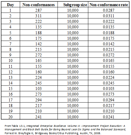
When examining time-series data, what we want to occur is the most appropriate action or non-action. However, the conclusion of what action or non-action to take can be a function of how the data are examined. This point will be illustrated using the data in Table 11, which provides the number of daily non-conformances that occur from the number of daily transactions that occur; i.e., 10,000.
These data could describe the number of daily non-conformances from an insurance company, hospital, or one-shift manufacturing facility.
Traditionally, proportion (p) non-conformance rates are tracked over time using a p chart to detect special-cause occurrences. This approach would be appropriate using a Shewhart strategy.
Whenever a measurement is beyond the LCL or UCL on a control chart, the process is said to be out of control. Out- of-control conditions are special-cause conditions, which can trigger causal problem investigations.
For the p chart of these data, shown in Figure 1, many causal investigations could have been initiated because there are many out-of-control signals. Out-of-control processes are not predictable; hence, no process capability claim should be made.
For p charts, failure rate p is tracked over time with an LCL and UCL of:

From these equations, the LCL and UCL are determined using the average non-conformance rate ( ) and subgroup size (n). When the subgroup size is large, as it can be in many business situations, the distance between the LCL and UCL can become quite small. Variability from day-to-day material lot differences or day-to-day transaction differences can create the type of out-of-control signals shown in Fig. 1.

Table 1: Time-Series Data from Process

Figure 1: Traditional p Chart of Defective Rate
30,000-foot-level Charting in lieu of the Traditional p Chart Control Limits Formula
An individuals (X) chart tracks an individual value over time where the chart’s control chart limits consider between-subgroup variability. When adjacent subgroups are used to determine average moving range ( ), the X chart has a LCL and UCL of:

Unlike with a p-chart, the control limits for an individuals or X chart are a function of the average moving range between adjacent subgroups. The importance of capturing between-subgroup variability when calculating statistical process control-chart upper and lower control limits was discussed in Control Chart Issues: 30,000-foot-level Chart Resolution.
The X chart is not robust to non-normal data; therefore, for some situations, data need to be transformed when creating the control chart. One example of a non-normal condition is when there is or tends to be a natural boundary condition. For this situation, the control chart can cause false signals where common-cause variability appears as to be special cause.
When attribute control-chart subgroup sizes are similar, an X chart can often be used in lieu of a p chart when creating a 30,000-foot-level chart. The advantage of this approach is that between-subgroup variability will impact control-chart limit calculations. An X chart of the non-conformance rate in Table 1 is shown in Figure 2.
This X chart indicates the process is in control and is quite different from the conclusion drawn from the control chart in Figure 1. When a process is in control, it can also be said to be predictable. When a process is in control/predictable, we can not only make a statement about the past but also use historical data to make a statement about what we might expect in the future, assuming things stay the same.

Figure 2: 30,000-foot-level Chart of Non-conformance Rate5
The process capability/performance metric for this process can then be said to have a non-compliance rate about 0.021. That is, since the process is in control/predictable, it is estimated that the future non-conformance rate will be about 0.021, unless a significant change is made to the process or something else happens that either positively or negatively affects the overall response. This situation also implies that Band-Aid or firefighting efforts can waste resources when fundamental business process improvements are really what are needed.
If improvement is needed for this 30,000-foot-level metric, a Pareto chart of defect reasons can give insight to where improvement efforts should focus. The most frequent defect type could be the focus of a new Lean Six Sigma project. For this Lean Six Sigma implementation strategy, I could say common-cause measurement improvement needs are pulling for the creation of a Lean Six Sigma project.
A subtle, but important, distinction between the two approaches is the customer view of the process. In the example above, the Shewhart approach (p chart) encourages a firefighting response for each instance outside the control limits, while the Integrate Enterprise Excellence (IEE) approach encourages looking at the issue as an organic whole – an issue of capability rather than stability. If the problem is an ongoing one, the IEE view is more aligned with the customer view (whether internal or external) of process performance. The process is stable, though perhaps not satisfactory, from the customer perspective.
No-charge Software App for 30,000-foot-level Chart Creation
The following video describes the application of a no-charge software app to use for your data sets, which addresses the problems with traditional p-chart problems.
Pulling for the Creation of Projects
The selection of projects within Lean Six Sigma is critical. However, organizations often work on projects that may not be important to the overall business. With this procedure, organizations could even be sub-optimizing processes to the detriment of the overall enterprise.
Business existence and excellence (E) depend on more customers and cash (MC2). The IEE system focuses on E = MC2 for project selection.
Within IEE, operational high-level metrics at the enterprise level pull (used as a Lean term) for the creation of projects. These projects can then follow a refined define-measure-analyze-improve-control (DMAIC) roadmap that includes Lean tools for process improvement or a define-measure-analyze-design-verify (DMADV) roadmap for product or process design needs.
Operational Excellence Application
For the presented data, the 30,000-foot-level report-out changed how one would view the process’ performance from considering that the process was not stable using a traditional p-chart approach to a process that has a non-compliance rate of about 2.1%, when assessing the process at the 30,000-foot-level. This approximate unacceptability rate can be expected in the future unless something changes. To improve a process’ common-cause level of performance when reported at the 30,000-foot-level, the process needs to be enhanced; e.g., through a Lean Six Sigma improvement project.
An organization can integrate the describe 30,000-foot-level form of performance metric reporting with the processes that created them through the Integrated Enterprise Excellence Operational Excellence System.
30,000-foot-level Charting Applications
The described 30,000-foot-level charting technique has many more applications than the described p-chart issues and resolution, as described in 30,000-foot-level Performance Reporting Applications .
Reporting at the 30,000-foot-level, with its predictive performance metrics, can also be used to transition common place scorecards and dashboards to predictive reporting. Eight illustrations and benefits of this transition are described in Organizational Predictive Performance Reporting.
When 30,000-foot-level charting is applied within an overall Integrated Enterprise Excellence (IEE) business management system, traditional scorecard and process improvement efforts that often have issues are addressed, as described in a 1-minute video:
30,000-foot-level charting can reduce the firefighting that can occur with traditional business scorecarding systems.The Integrated Enterprise Excellence (IEE) business management system uses 30,000-foot-level charting to address these issues.

References
- Walter A. Shewhart, Economic Control of Quality of Manufactured Product, ASQ Quality Press, 1931, reprinted in 1980.
- Western Electric, Statistical Quality Control Handbook, Western Electric Co., 1956.
- W. Edwards Deming, Out of the Crisis, MIT Press, 1986.
- Forrest W. Breyfogle III, Integrated Enterprise Excellence Volume III – Improvement Project Execution: A Management and Black Belt Guide for Going Beyond Lean Six Sigma and the Balanced Scorecard, Bridgeway Books/Citius Publishing, 2008
- Figure created using Enterprise Performance Reporting System (EPRS) Software
Next Steps
- Link the free 30,000-foot-level app to your personal and corporate websites so you and your organization can conveniently access this powerful free tool.
- Discuss the benefits of 30,000-foot-level metric reporting and IEE in your organization by scheduling a video meeting session with Forrest through the link.

