A probability plot can be used to quantify process performance through a 30,000-foot-level report-out. In one chart, a 30,000-foot-level report can include a process stability assessment through an individuals chart(s) and a probability plot to make a predictive statement for process performance.
This statistical foundation supports the broader discipline of predictive performance metrics, where organizations translate process behavior into forward-looking business insight and executive decision clarity. For a strategic view of how predictive metrics replace traditional dashboards and reactive reporting, see our pillar guide:
👉 Predictive Performance Metrics | Achieve Clarity, Stability & Better Executive Decisions
A probability plot for process performance provides a better methodology to better understand how well a process is performing to specifications than traditional approaches. This approch provides statistical modeling of process behavior.
A probability plot can be used to quantify process performance relative to customer needs or specifications, in lieu of using traditional indices. This is an extension of the more often applied probability plot, which assesses the hypothesis whether data are from a particular distribution or not; e.g., normal distribution, log-normal distribution, or Weibull distribution.
The interpretation of a probability plot can initially appear intimidating but is not difficult to understand when one becomes accustomed to this powerful approach to presenting information. Consider the following illustration.
Probability Plotting for Process Performance Illustration
Content of this article is from Chapter 12 of Integrated Enterprise Excellence Volume III – Improvement Project Execution: A Management and Black Belt Guide for Going Beyond Lean Six Sigma and the Balanced Scorecard, Forrest W. Breyfogle III.
To use a probability plot for the quantification of process performance, one needs to determine first if the process is stable from a 30,000-foot-level perspective, as described in 30,000-foot-level Charting with its Predictive Measurements.
The data in Table 1 were collected using an infrequently subgrouping/sampling plan that is consistent with application of a 30,000-foot-level charting methodology.1 This time-series data was determined to be from a stable process, as described in the article Individuals Control Chart (XmR chart, I-chart) Reporting.
This article will discuss the interpretation of a probability plot that was created from the stable process’ data to assess process performance relative to specification limits of 72 and 78.
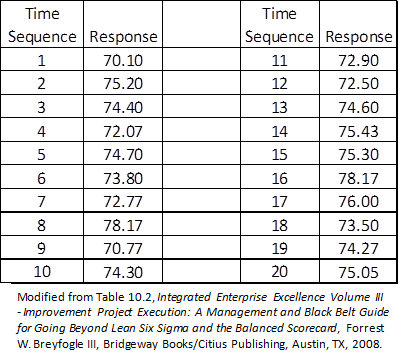
Table 1: Time-series Data
Figure 1 provides a histogram plot of the data with a normal probability density function (PDF) overlay. The area under the curve of a well-fitted PDF beyond upper and lower specification limits is an estimate for the current level of process non-conformance. For this estimate to be valid:
- The selected distribution (e.g., normal) needs to have a good representative data fit. This can be difficult to determine when visually comparing a mathematically-calculated PDF plot to a histogram.
- A distribution analysis for process performance analysis is needed to determine the area under the PDF function beyond the specification limits.
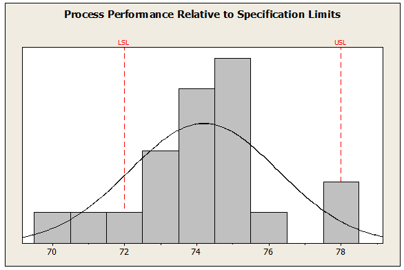
Figure 1: Histogram and Probability Density Function (PDF)
These two objectives for quantifying process performance are more easily achieved through a probability plot of the data, as shown in Figure 2. In this process data distribution analysis plot, the x-axis is process response and the y-axis is percent less than.

Figure 2: Probability Plot
This probability plot provides a process performance statement relative to specification limits of 72 and 78. There is no reason to believe that these data do not follow a normal distribution since the P-value is 0.522 (upper right table of plot), which is greater than 0.05, a commonly-used value in hypothesis testing for determining statistical significance. From this plot, a process predictive performance metric estimate would be 17.4% non-conformance [(100-96.793) +14.192 = 17.399], which is consistent with a visual estimate of the area under the curve in Figure 1 beyond the specification limits.
An overall summary about this process and its performance can be netted out using a 30,000-foot-level charting format, as shown in Figure 3. The bottom of a 30,000-foot-level report-out includes a quantification of whether a process has a recent region of stability (predictable process) or not and a prediction statement, if the process is predictable.

Figure 3: 30,000-foot-level Chart2
Interpretation of 30,000-foot-level Level Charts
A 30,000-foot-level chart’s predicted value provides an estimate for future performance, given that nothing changes in the process; i.e., the results of a process’ current level of common-cause variability. If the predicted value is not satisfactory, the process needs improvement. A statistical hypothesis testing of causal theories from the recent region of stability can be helpful to gain insight as to what could be done differently to improve the process’ performance. For example, an analysis may show the impact from the use of differing operating procedures when executing a process; i.e., how procedure differences impact the current process’ common-cause variability magnitude.
The result of this analysis could lead to a selection and execution of the best procedure, which would transition the 30,000-foot-level control chart to a new level of stability that has an improved level of performance. Chapters 22 – 28 of Integrated Enterprise Excellence, Volume III: Improvement Project Execution(1) provides the tools for making the described statistical assessments. Application of the book’s detailed process improvement roadmap is provided through Lean Six Sigma training, which references this publication in its blended on-line or stand-up education.
You can use our free 30,000-foot-level reporting app for your Excel dataset. More often than not a 30,000-foot-level report will provide more insight into your process than traditional reporting methodologies have ever shown.
Set up a short video session with Forrest for help creating your dataset 30,000-foot-level report (https://smartersolutions.com/schedule-zoom-session/).
If you prefer email, send your email to forrest.breyfogle@smartersolutions.com.
30,000-foot-level Charting Applications
The described 30,000-foot-level charting technique has many applications, as described in 30,000-foot-level Performance Reporting Applications.
Eight illustrations of transitioning traditional dashboards and scorecards to 30,000-foot-level reporting where probability plotting for quantifying process performance is used for continuous data is described in the article Predictive Performance Reporting.
The Integrated Enterprise Excellence (IEE) use of 30,000-foot-level reporting addresses the business scorecard issue that are described in a 1-minute video:

References
- Forrest W. Breyfogle III, Integrated Enterprise Excellence Volume III – Improvement Project Execution: A Management and Black Belt Guide for Going Beyond Lean Six Sigma and the Balanced Scorecard, Bridgeway Books/Citius Publishing, 2008.
- Figure created using our Free 30,000-foot-level Reporting App.
More information about the enhancement of traditional business metric reports is described in “Positive Metric Performance Poor Business Performance: How Does this Happen?”
Contact Us to set up a time to discuss with Forrest Breyfogle how your organization might gain much from an Integrated Enterprise Excellence (IEE) Business Process Management System and its 30,000-foot-level performance reporting with a probability plot.