The question “How is a control chart used?” is a critical inquiry that I will rephrase to “How is a control chart used so it leads to the best behavior?”
This article will highlight issues with traditional control charting and provide a free app that provides a more effective approach to address these issues.
To begin this discussion, we need to delve into philosophy.
How is a Control Chart Used: Purpose of Control Charts
As a starting point, we should agree that control charts:
- Should lead to the best behavior, i.e., either to do something or not, for a particular metric situation?
- Have a primary purpose of identifying special cause signals and taking action if an out-of-control signal occurs and warrants investigation?
- Do not assess the capability of a process for meeting a specification; hence, control charts by themself do not address whether there is a need for process improvement.
Common Cause Variation According to Deming
According to W. Edwards Deming, common cause variation is a fundamental part of a system, representing the inherent, predictable variation that exists within a stable process. It is caused by the system itself, including how it was designed and is managed, and affects every outcome. To improve a process, one must focus on making fundamental changes to the system to reduce this common cause variation, rather than reacting to individual outcomes. (Reference: Internet Search)
How is a Statistical Process Control Chart Used in the Relationship Y=f(X)
A process output Y response is a function of its inputs Xs, i.e., Y=f(X)
Consider the situation where there is a difference in the output of a process (Y) due to varying inputs such as shifts, days of the week, production lots, or operators (Xs).
Should these “assignable causes” be considered special cause events that will “take time to resolve,” or a source (among other things) of common-cause variables (Xs) in the Y-creation process to consider as potential opportunities for improvement if the overall Y response is undesirable?
It is important not to get caught up in the “common-cause” or “special-cause” definitions.
From the above “Common Cause Variation According to Deming” paragraph, one could make the argument that these four input variables are “part of a system” for providing a product or service, whether they have an “assignable cause” for creating a problem or not, during the process of making the product or service.
If one were to say that each of the above process inputs should be considered a special cause in a statistical process control chart, numerous similar identified activities would be a nightmare to track on their own control charts. These activities could result in firefighting individual point-in-time excursions, which can originate from overall common-cause variability (i.e., the typical variability of the overall system).
In manufacturing, let’s consider that the differences between shifts, days of the week, production lots, and operators are significant. That does not mean we have a manufacturing problem in fulfilling customer needs due to these differences; i.e., the Y responses effectively meet customer needs.
However, suppose we are not meeting customer needs. In that case, there is a need for process improvement, which may involve reducing variation between shifts, days of the week, production lots, operators, or other factors.
Control charts do not address the fulfillment of customers’ needs.
One might argue with this statement about what control charts do not do. Someone may say that other techniques, in conjunction with control charts, could be used to determine how a process is performing in relation to meeting customer needs.
This approach is possible; however, an experienced person may use one technique, while a novice might use another, less effective approach. I view this difference in measurement technique as not unlike a device having a Lean Six Sigma Gage R&R measurement problem.
What is needed is an approach that yields the same basic result and action plan (or non-action plan) regardless of who sets up the measurement.
There is a need for a tool that assesses the process stability of Y from a high-level vantage point, where differences between shifts, days of the week, production lots, or operators are considered potential sources of common-cause variation (among other things), and provides a process-capability statement relative to fulfilling customer needs in clear, easy-to-understand language – in one report.
A 30,000-foot level report fulfills this need.
- The following section describes the benefits of our 30,000-foot-level reporting methodology and a free app for creating a 30,000-foot-level report for your Excel dataset of a process output Y response.
- The subsequent sections provide examples of false out-of-control signals from traditional control chart methods that are resolved with a 30,000-foot-level report.
Why Our Free App Beats Traditional Control Chart Software
Most control charting tools on the market today rely on decades-old statistical methods that often mislead more than they inform—especially when it comes to understanding real-world process variation.
Our free 30,000-foot-level Reporting app is built to move beyond outdated limitations and deliver smarter, more actionable insights.
Here’s how we’re different:
✅ See the Big Picture—Not Just Noise
Traditional software often triggers false alarms by mistaking routine variation for special-cause issues. Our app employs a 30,000-foot-level approach, which accounts for both within- and between-subgroup variability, enabling you to determine whether your process is genuinely out of control or just fluctuating within normal limits.
✅ Clear Performance Insights Without Statistical Jargon
Instead of cryptic capability indices like Cp, Cpk, or Ppk, our app translates your data into what matters most: predicted performance and nonconformance rates. This approach for tracking the output of the process makes it easier for everyone—from engineers to executives—to understand process capability at a glance.
✅ Designed for Real-World Use
Our app is built by practitioners who understand the day-to-day realities of manufacturing, healthcare, and service industries. It’s not a generic SPC tool—it’s a practical solution that focuses on meaningful results, not just statistical elegance.
Potential 30,000-foot-level Report Users
✅ A leading thinking practitioner (using our free app) can compare a dataset’s traditional control chart to a 30,000-foot-level report. It is almost a certainty that the 30,000-foot-level report will provide more insight into the process than has been seen before. This practitioner can share the results of their findings with others in their organization.
✅ A Lean Six Sigma Black Belt can use a 30,000-foot-level report from our free app to baseline a metric that they are to enhance through the execution of a process-improvement project. Successful completion will display the individuals chart(s) in a 30,000-foot-level report, staged to an improved level of performance, along with a statement at the bottom of the report stating the expectation for future process-output performance – if the process improvement changes are maintained.
✅ Statistical Software Companies: I do not suggest that software companies eliminate their traditional control charting software. What I am suggesting is that the inclusion of our 30,000-foot-level reporting software with their software offerings will benefit their customers. Please contact us to discuss how to accomplish this integration.
✅ For Profit and Non-Profit Organizations: 30,000-foot-level reports are beneficial in tracking operational metrics such as lead times, nonconformance rates, a critical dimension or characteristic of a product (e.g., viscosity), and customer satisfaction. In addition, organizations gain much when they replace red-yellow-green scorecards and tables of numbers reports with 30,000-foot-level reports. These organizations can use our free app or contact us about how they can have 30,000-foot-level reports automatically updated daily behind their firewall.
Make the Smart Shift
Start using statistical tools that actually reflect your process reality. Try our free app and experience a better way to track, analyze, and improve your processes—without the noise, the cost, or the confusion.
An xbar and r control chart can create false special cause signals
The article “Issues and Resolution to xbar and r chart Formula Problems” provides the mathematical details of why the following traditional Xbar and R control chart (shown on the left) generates many false out-of-control signals, which are considered a source of common-cause variability, unlike the 30,000-foot-level report displayed on the right, which also offers a futuristic statement at the bottom of the report (BTW, if this predictive statement is undesirable, there is a need for process improvement.)
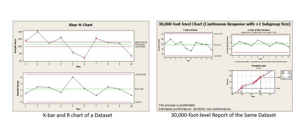
The following summarizes the above-linked article.
In quality control, Xbar and R control charts are widely used to detect process instability (i.e., special-cause variation) in subgrouped time-series data, and to guide timely corrective actions. However, when used in practice, these charts can suffer from hidden pitfalls tied to how subgroup variability is handled. Below, we explore the core issues and propose an alternative “30,000-foot-level” approach to improve insights into both process stability and performance.
What’s the Problem with Traditional Xbar and R Charts?
1. Spurious out-of-control signals from between-subgroup variance
If a process exhibits substantial natural variation between subgroups (for instance, from day to day), a conventional Xbar and R chart might flag many false alarms (i.e., signals indicating special cause), even if the underlying process is stable.
2. Misleading capability statements
Using standard subgroup-based statistics to compute process capability (e.g. Cp, Cpk, Pp, Ppk) can lead to inconsistent or confusing results—especially if the way subgroups are formed doesn’t align with real-world variation sources.
3. Overreaction and “firefighting”
Because many false signals may be generated, organizations may be compelled to chase phantom problems repeatedly. This situation can consume time and resources without actually improving the process.
In short, the traditional approach can conflate “noise” (common-cause fluctuation across subgroups) with special cause “signals”, leading to misleading operational decisions.
A Higher-Level Alternative: The 30,000‑Foot Approach
To escape these limitations, you can adopt a “30,000-foot-level” (i.e., high-altitude) view of the data:
Infrequent subgroup sampling
Instead of tightly grouping data into frequent subgroups (e.g., production shifts), draw more sporadic or widely spaced samples (e.g., weekly or monthly). This action allows for between-subgroup variation to be naturally captured as part of the overall variance, rather than being filtered out.
Integrate between- and within-group variance into limits.
Build control limits that account for both within-subgroup variation and between-subgroup variation. This change ensures that the control limits are more realistic, reducing the likelihood of false alarms.
Simpler performance reporting
Rather than relying solely on capability indices that many find opaque, the 30,000-foot-level method can produce a more intuitive measure: a predicted nonconformance rate (i.e., percentage out of specification) when specifications are in place.
Concept in Practice: Example Summary
Imagine a process measured daily across 5-item subgroups. Traditional Xbar and R charts flag many points beyond control limits, suggesting “out-of-control” behavior. But when you zoom out and apply the 30,000-foot approach:
- The process may appear stable when seen at the broader level.
- You derive a more meaningful metric: e.g., an estimated 27% nonconformance rate in future operations (unless changes are made to the X’s that improve the Y response).
- You avoid chasing ephemeral signals and instead focus on improving the broader variability profile.
Key Takeaways & Implementation Advice
- Traditional Xbar and R charts can mislead when there is substantial between-subgroup variation that is actually part of normal process behavior.
- The 30,000-foot-level method helps you see the “forest, not the trees”—by embedding both within- and between-group variance and giving a more actionable summary of performance versus specification.
- To implement this:
- Choose more widely spaced sampling intervals that are physically meaningful; e.g., weekly if there is an expectation that the Y response differs by day of the week. Build control limits reflecting the complete variance structure.
- Translate performance into a nonconformance rate from a 30,000-foot-level probability plot, when there is a specification. Our app provides this value automatically at the bottom of the report for stable processes.
Shewhart Control Charts: P-charts Issues and Resolution
The article “Issues and Resolution to p-chart Control Limits Formula False Signals” provides the mathematical details of why the following traditional P-chart (shown on the left) generates many false out-of-control signals, which can be considered a source of common-cause variability, unlike the 30,000-foot-level report displayed on the right, which also offers a futuristic statement at the bottom of the report. (BTW, if this predictive statement is undesirable, there is a need for process improvement.)
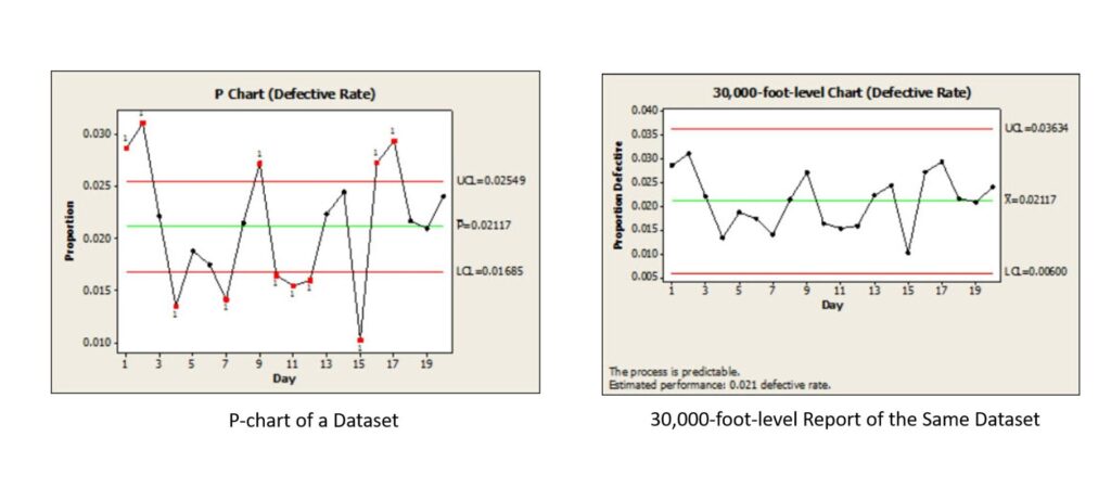
A summary of this article is:
Traditional p-charts are often used to monitor the proportion of nonconforming units or defectives over time. However, the article explains that these charts frequently produce false signals when there is “common cause variation between subgroups. The standard p-chart formulas assume a consistent level of variation across all subgroups—an assumption that rarely holds true in real-world data. As a result, organizations may chase random fluctuations as though they were meaningful process shifts, wasting valuable time and resources.
The article introduces a more reliable alternative: the 30,000-foot-level individuals chart approach. Rather than relying on traditional binomial-based control limits, this method uses an individuals (X) chart of proportions, which properly accounts for variation between subgroups. This provides a truer picture of process stability and performance capability. When the process is found to be stable, a predictive performance metric can then be established—offering management a statistically valid way to forecast future outcomes.
Shewhart Control Charts: C-charts Issues and Resolution
The article ” Issues and Resolution to C Chart Formula Problems” provides the mathematical details of how to handle the situation when failures do not occur frequently (e.g., the number of monthly safety occurrences – a good thing) (Figure on the left), unlike the 30,000-foot-level report displayed on the right, which provides a more actionable (or non-actionable) response if the time (days) between incidents is not as big as desired. For all 30,000-foot-level reports, if a prediction statement at the bottom of a report is undesirable, there is a need for process improvement, i.e., improving the Xs in the relationship Y=f(X).
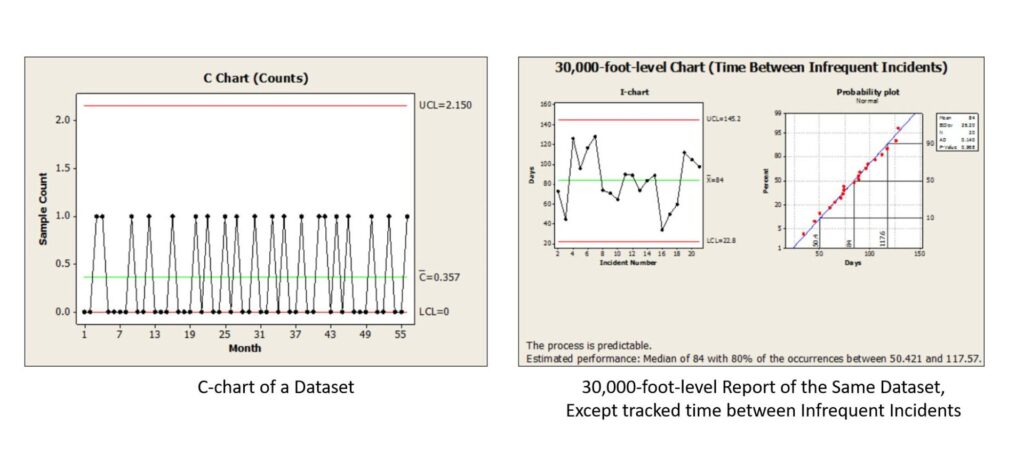
A summary of this article is:
This article highlights flaws in the standard C-chart method, particularly when subgroup-to-subgroup variability is present. Ignoring this between-subgroup variation can cause the c-chart to flag patterns as “out of control” when in fact they stem from normal fluctuations. That leads organizations down the wrong path—chasing false alarms and misallocating resources.
To address the additional issue of many zeros in the C-chart, which often occur in these reports, the article proposes adopting a 30,000-foot-level individuals (X) chart approach for tracking the time between incidents (e.g., days between plant safety incidents). Unlike the conventional c-chart, this method factors in variation between subgroups by using a moving average range to establish control limits. The result is a more accurate separation of common-cause vs. special-cause behavior, along with a more explicit and predictive process performance statement (e.g., mean time between incidents). This alternative can also handle data transformations when distributions deviate from normality, improving robustness.
30,000-foot-level Reporting Example: Home to Work Commute Time
The article “KPI Management: KPI Metric Reports that lead to the Best Behaviors” uses the home-to-work commute time for someone to illustrate:
- Why does the simple setting of a goal and assessing why the goal was not met for each undesirable point not work?
- Benefits of 30,000-foot-level reporting over red-yellow-green goal-setting scorecards.
- How to demonstrate improvement in a 30,000-foot-level report.
The above link provides a video, along with descriptive text and graphics, to illustrate the situation and benefits of 30,000-foot-level reports when making process improvement.
Integration of 30,000-foot-level reporting with Statistical Software Analyses for Process Improvement
A basic process for integrating 30,000-foot-level reporting with statistical software such as Minitab, JMP, Sigmaxl, and MoreSteam’s EngineRoom for making process improvement to a Y process-output response in the relationship Y=f(X) is:
- Determine what 30,000-foot-level metric to improve so the business will have a financial benefit (beyond the scope of this article). This 30,000-foot-level Y report could be an attribute response or a continuous response that has subgrouping or no subgrouping. The data may or may not have a transformation.
- Create a 30,000-foot-level report for the Y-output response of data over a long period of time that has no calendar-year boundary.
- Select a process improvement roadmap. I will outline the key highlights of a Lean Six Sigma DMAIC roadmap to identify and improve the Xs in a process that will enhance the Y response.
- Conduct a brainstorming session with a team familiar with the process to list the X’s that may impact the output response, Y.
- Collect appropriate data and use statistical analysis software to visualize and conduct hypothesis tests of the Y =f(Xs) relationships determined from the brainstorming session. Potential statistical tests include regression, Analysis of Variance (ANOVA), Analysis of Means (ANOM), comparison tests, and General Linear Model (GLM).
- Conduct Design of Experiments (DOE) when appropriate.
- Use results from analyses to identify potential changes to the process that could positively impact the improvement project’s Y response.
- Pilot test the effectiveness of the identified process-improvement changes to the Y from the X’s.
- Implement identified changes to the process.
- Stage the 30,000-foot-level individuals plots(s) if there is a change in the Y response that the process Xs changes should have caused.
- Identify the new performance of Y response noted at the bottom of the 30,000-foot-level report, if the new process response is stable (i.e., predictable).
- Determine the significance and confidence level of the change using data from before and after the change, if the 30,000-foot-level chart was staged due to the process improvement work.
- Quantify the financial benefit of the process-improvement project.
Summary and Next Steps
Organizations gain much when they apply 30,000-foot-level reporting in their business. Organizations can save a significant amount of money, time, and frustration by avoiding the issues that traditional control charting and business performance reporting metrics, such as red-yellow-green scorecards, can cause.
If you’re ready to see how you and your organization can benefit from these techniques, contact Smarter Solutions, Inc. today.